.png?width=187&height=40&name=AppVentory%20Logo%20(White).png)
What you get
The trend behind the bill, plus a repeatable way to investigate what is driving a rise or fall before you act on it.
Where the comparisons live
Dashboard carries the headline: Total App Spend for the last twelve months and the change on the year before. Spend Over Time shows the monthly shape, with average monthly spend and the upcoming renewal spend for the next three months beside it.
Every app's Overview tab breaks its own spend into last twelve months, fiscal year to date, last year and average monthly cost — so you can see whether one tool is driving the trend.
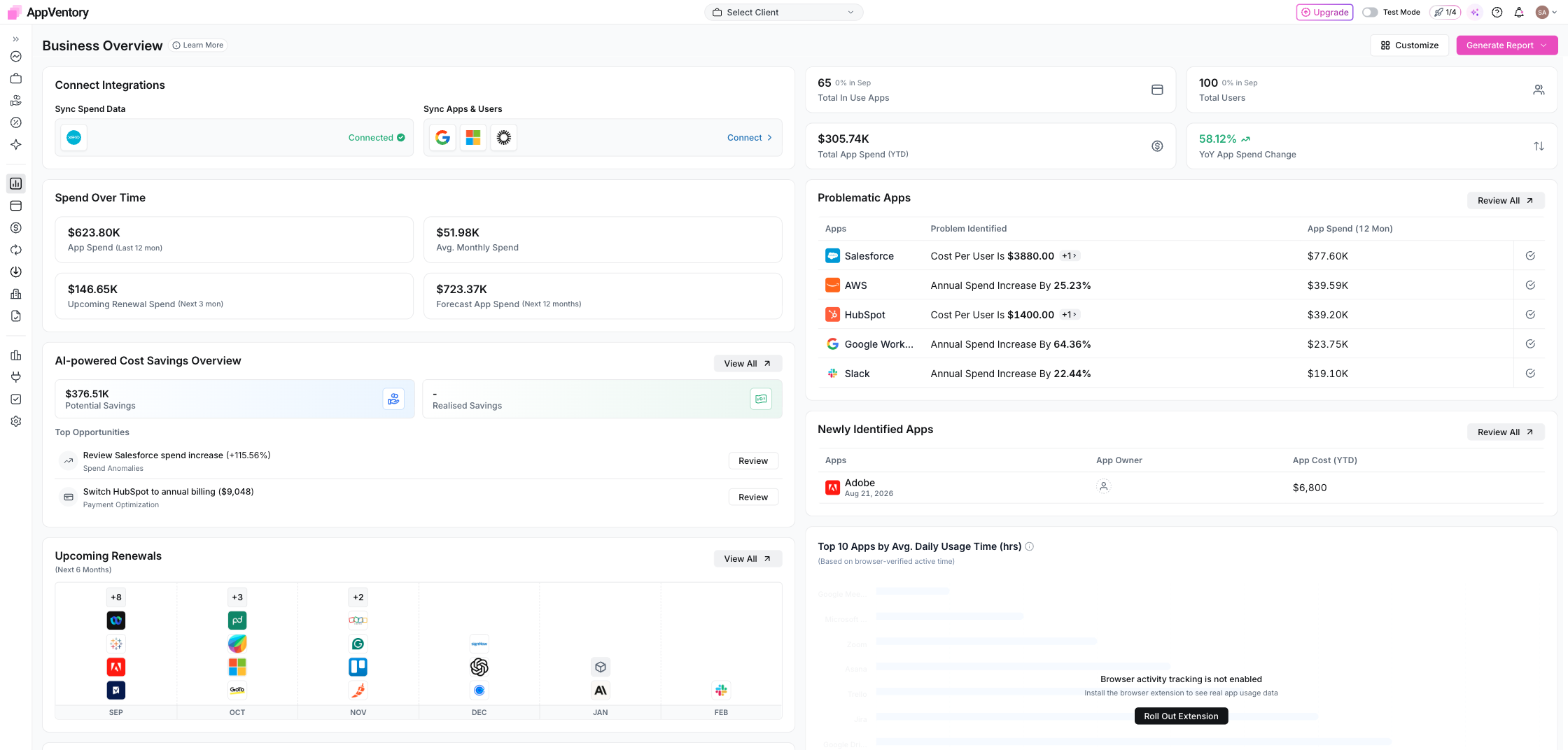
Dashboard showing total spend and spend over time
The forecast
Forecast App Spend projects the next twelve months from your previous spend patterns. Treat it as an estimate for budgeting rather than a commitment — it is built from history, and a renewal you renegotiate will change it.
Reading a rise
A year-on-year increase can have several causes:
- More users or licences. Compare user counts and app ownership.
- A price or billing change. Trace when the spend changed and review the underlying transactions.
- A new application or newly mapped spend. Check whether the comparison period had the same app and mapping coverage.
- Timing effects. Annual charges, back-payments or one-off implementation costs can create sharp monthly differences.
Reading a fall
Check your connection history first. A month with a dropped integration looks exactly like a saving.
What you've unlocked
You can now describe a spend change with the evidence behind it rather than relying on the headline percentage alone.