.png?width=187&height=40&name=AppVentory%20Logo%20(White).png)
What you get
A more useful view of the total: which owners, departments, categories or organisations account for the spend you are reviewing.
By owner
App Spend by Owner on the Dashboard puts a number beside each person who owns an app. It only works once owners are assigned, which is why Assign app owners comes first. A large "unassigned" block on this chart is a sign that findings will stall for lack of anyone to take them to.
By department
App Spend by Department shows where the money sits across the organisation. Open Organization and the Departments tab reads the same spend against each department's annual budget, with % Budget Used turning red past 100%. In our example account one department sat at 265.6% of budget — the kind of number that changes a conversation.
Budgets depend on the fiscal year set in Settings → Preferences. Get that wrong and every budget figure is wrong.
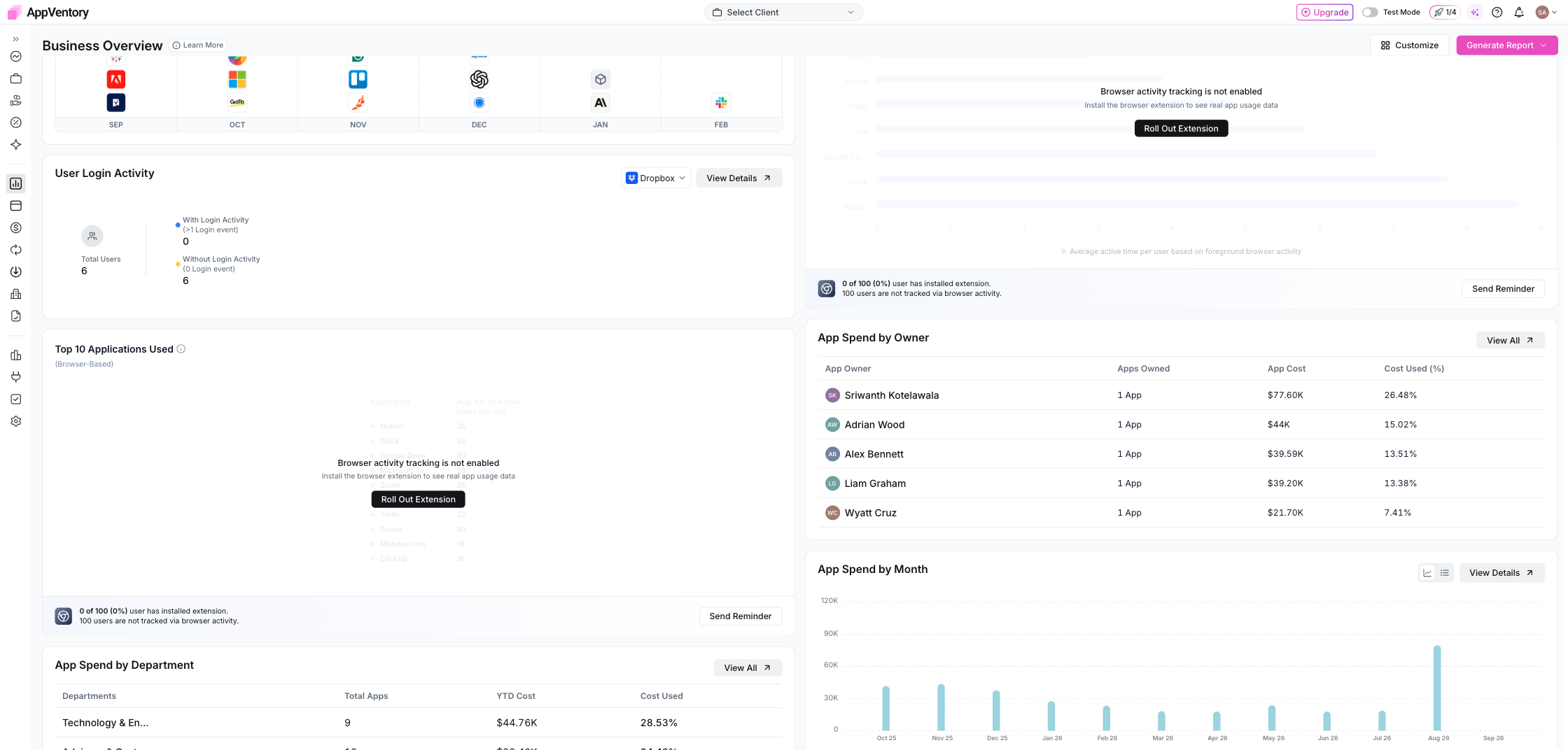
Dashboard showing App Spend by Department and by Owner
By category
The Top App Categories by Spend view shows concentration. Several applications in the same category can be worth reviewing for overlap, but category count alone is not proof that the tools are redundant.
By organisation
For advisors, use organisation and client context to understand which client a spend record belongs to before you compare clients across the portfolio.
What you've unlocked
You can now move from a software-spend total to the part of the organisation or portfolio that needs the next conversation.